Logo Placement Guide: The Top 8 Print Locations and Why They Work Best

November 14, 2022

DESIGN

Logo Placement Guide: The Top 8 Print Locations and Why They Work Best

November 14, 2022
Before you create your next custom t-shirt in our Design Studio, it’s important to know about the standards. There’s a reason why the vast majority of prints are in standard locations: they are tried and true. We’ve tried them all, and it’s true.
Whether you’re getting screen printing, digital printing, or using DTF transfers, there are rules that all professional printers follow. You can get ahead of the game by knowing the rules (before breaking them). You may even want to get wild with an alternative location.
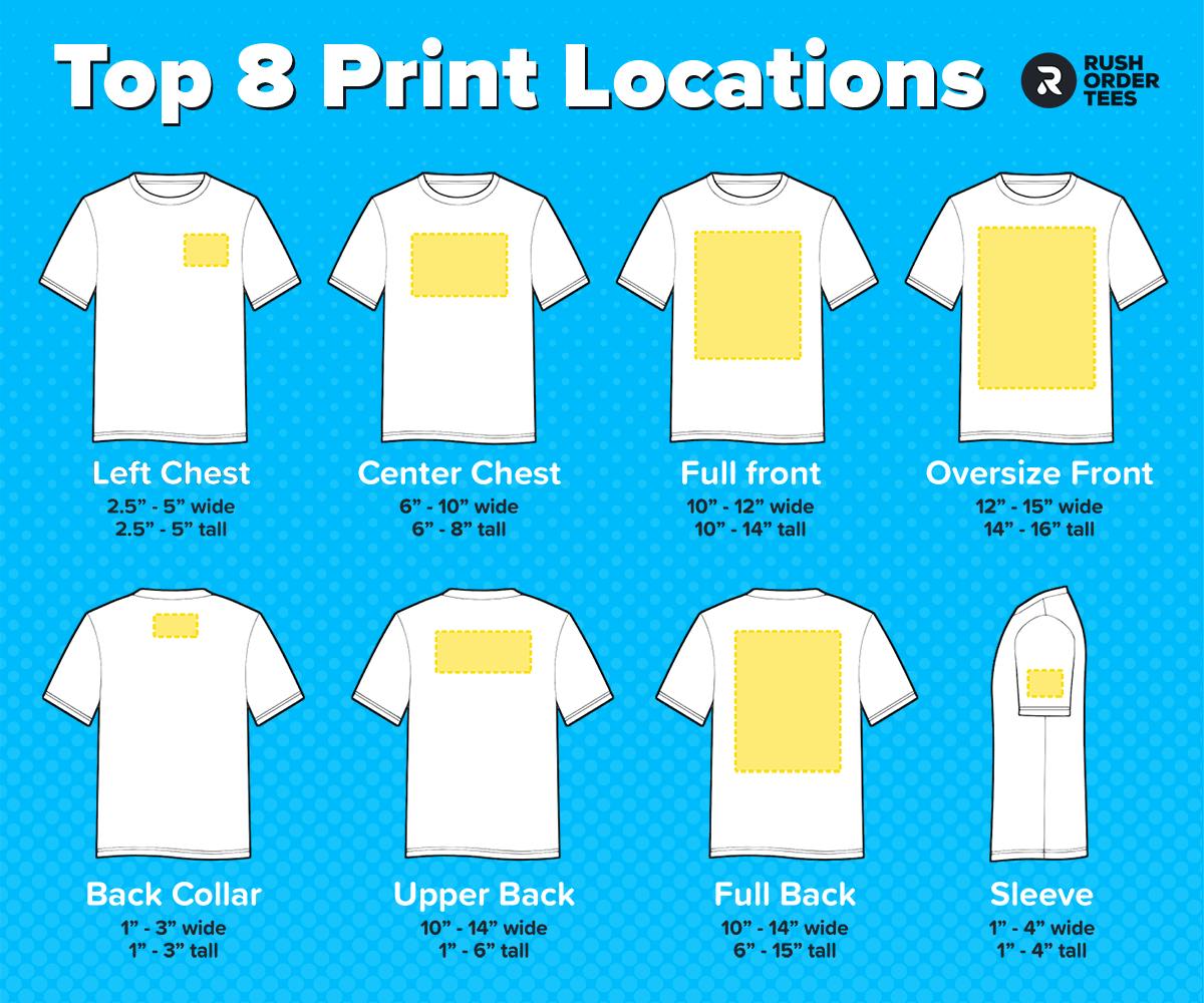
This article describes the top 8 standard print locations and provides some additional information about each one to help you decide where to print your logo or design.
Before diving in, here are the definitions of common printing terms used in this article:
- Print location – This category name refers to the location on the garment. The placement and print area can vary within the print location. It can loosely reference size and position.
- Print placement – The measured position where the print will go. This can typically vary by a few inches or more, depending on the size of the garment, preference, and other factors.
- Print area – Sometimes used to mean print location, but specifically, it’s the surface area of the fabric that the ink will cover (important when it comes to pockets, seams, buttons, etc.)
- Print size – The exact measurement of the artwork to be printed. Along with print placement, this will dictate the print area. We highly recommend determining your exact print size.
- Standard size – Each print location has a standard size that we use when customers don’t request a particular size. This may be adjusted slightly based on the design and garments.
- Oversize – Anything bigger than standard. It’s not a common request, but this size falls somewhere between standard and maximum (maximum is also considered oversize).
- Maximum size – As the name implies, it’s simply the maximum size that can be printed for a particular order. It will vary depending on the item and print method, but easy to request.
- Anchor point – The point on the design that should be centered, rather than the midpoint. This is useful to identify on designs that are not naturally symmetrical. Example coming up.
For more in-depth explanations, read my post about printing terminology.
Now on to the top 8 print locations and the standard size and placement for each:
1. Left Chest
The classic, and the go-to location for your logo when you’re providing shirts for employees, or staff for an event, or anything really.
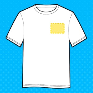
The size is tasteful; typically 3” to 4” wide, and around 3″ down from the collar. Placement can adjust to correspond with the size of the shirt, so it always looks right. On the left.
One of the trade-offs for this location is image detail. You want to avoid designs with a lot of detail because people won’t be able to see them. So keep it simple.
Our Art Department can advise you on this, and simplify your logo if needed. Usually with no additional fee.
This shouldn’t be confused with Right Chest, although it often is. To be clear, the left refers to your left– when you’re wearing it. Right Chest is fine if you prefer that, but it’s not a standard.
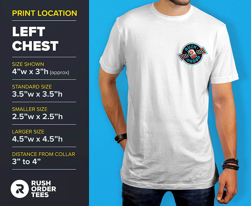
Pro tip: Pair it with a Full Back print for the classic combo: a simple brand logo on the Left Chest, and put the more detailed, colorful, or elaborate artwork for the back. The Left Chest location is back in style, so you can look both professional and trendy.

2. Center Chest
Another classic location, and it’s exactly where you would expect it to be: in the center, on the chest.
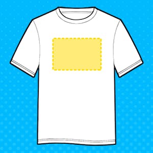
This is a moderately sized print, so it’s almost always fully visible, even if someone is wearing a jacket, hoodie, or open button-down shirt. Superman’s “S” is a Center Chest.
The size is typically larger than a Left Chest– but not quite as large as a Full Front.
The range is anywhere from 6” to 10” wide, so 8” would be average, and placement is around 4″ down from the collar. Make sure you specify what you want, or have one of our designers size it.
If you were planning for a standard front print, you have a choice between this location and a Full Front (see below). The range of garment sizes in your order could help decide; if they skew smaller, especially into youth sizes, go with Center Chest. If they skew larger, into the 3XL range, you may want to go with a Full Front.
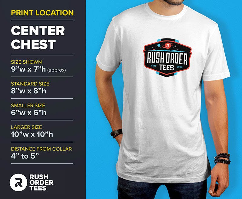
Pro tip: If your garment sizes range all the way from smaller youth to adult 3XL, you may want to consider ordering two separate print sizes. This might cost a bit more, but your design will look great across all the different sizes.

3. Full Front
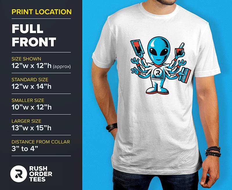
We now arrive at what is probably the most common print location. When people say “front” they usually mean Full Front. The standard size for Full Front is 12”w x 14”h, and placement is around 3″ down from the collar.
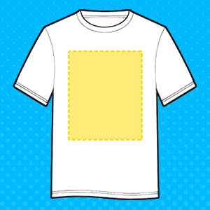
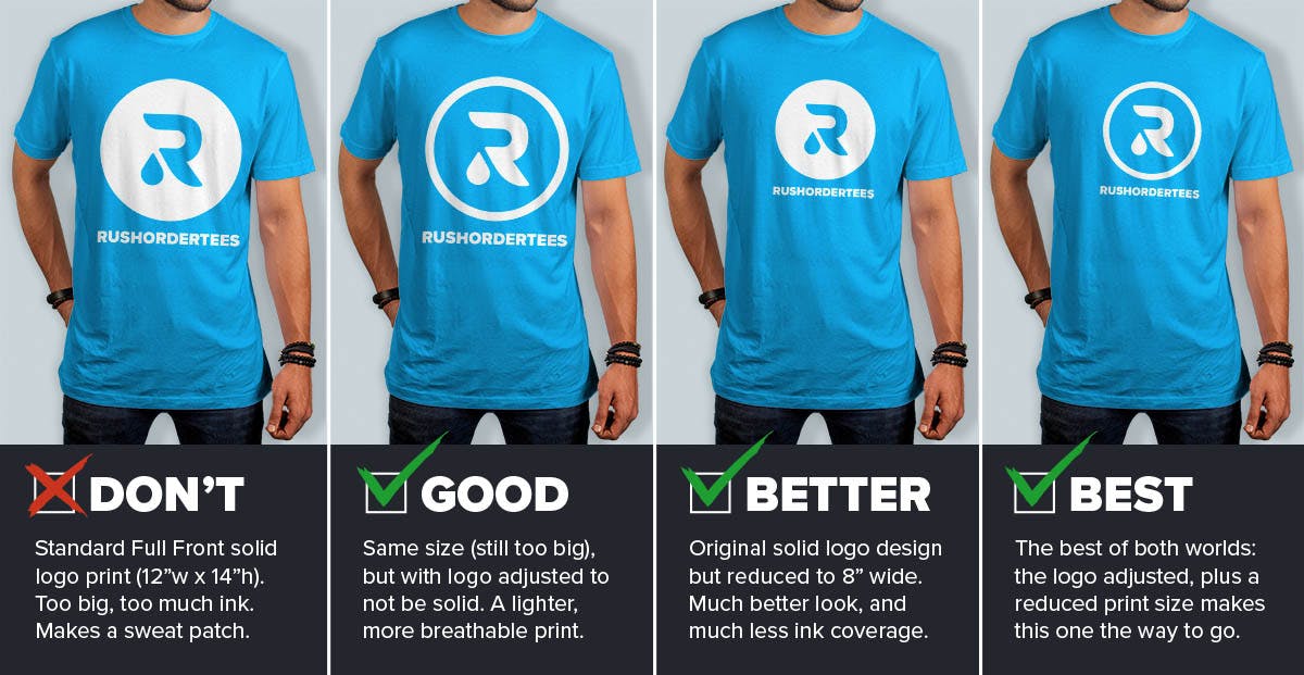
For certain designs, this size can look very large. And if you’re getting screen printing, you can end up with a lot of ink on the shirt, which can result in a heavy print that isn’t breathable, also known as a “sweat patch”, for obvious reasons.
This is when you want to think about your print area. In other words, the surface area that your design will cover, similar to the square footage of a house. If your design isn’t very tall, you can feel free to print it wide. If it’s a tall design, you may want to reduce the overall size.
There are other things you can do to reduce the overall print area without necessarily changing the size of the print. Let’s look at some examples to illustrate the point.
Pro tip: For promotional T-shirts that you’ll be giving away, if you print your logo too large, people won’t wear it as much– nobody wants to be a walking billboard (unless they are a true die-hard fan). Keep your branding modest or subtle and choose a high-quality T-shirt to maximize the chances it will be worn around town with pride.

4. Oversize Front
If you thought Full Front was big, Oversize Front is even bigger. As the name suggests, it’s over the size that should probably be printed on a T-shirt. But enough people like it and want it, so it makes the list.
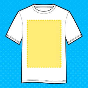
An Oversize print is anything bigger than a standard-sized Full Front. Our normal maximum print size is 14” wide by 16.5” high, but in special cases, we can go larger. Placement typically starts higher than a normal-sized front, around 2″-3″ down from the collar.
Keep in mind, you may be restricted based on your garment size. For example, we cannot print 14″ wide on youth sizes, smaller ladies’ sizes, or tank tops, v-necks, etc. In that case, you would need to set up two different print sizes.
Some designs lend themselves better to Oversize print, and some designs should not be printed Oversize. The same principle I described for Full Front is going to apply here: you’ll want to consider the surface area the ink will be covering when selecting this size.
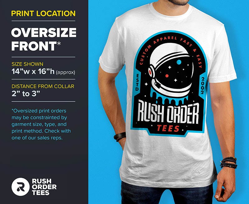
Here’s an example of what to do and not do with an Oversize print design.
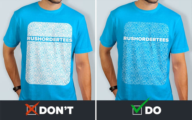
DON’T: The design on the left is mostly covered with white ink. It’s a heavy print without much breathability. Although there are some openings where the lines are (which helps keep it flexible) it’s almost a solid ink surface. This is jokingly referred to as a “sweat patch”, for obvious reasons. For oversize prints, look for ways you can reduce the amount of ink.
DO: The artwork on the right has been adjusted by “inverting” it (switching from positive to negative on the large ink areas). Not every design can be changed this way, but many can. This resulted in the ink coverage being reduced by about 80% (if not more), making a more light, flexible, and breathable print that is more comfortable and looks better.
Pro tip: Print out your design at your full desired size using your home printer or office printer. You can “tile” the design (it should be one of the print options). Then tape the four pages together and place them on a T-shirt. This will show you exactly how big it is in real life.

5. Collar / Small Upper Back
This print location started out as an alternative, then became so popular it’s become a standard. Kind of like Radiohead. Anyway, it’s a great place to put a logo and that’s usually what gets printed here.
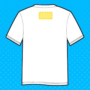
This is sometimes referred to as the “Yoke” which comes from those old-style cowboy shirts with the panel on the upper back. We think Back Collar is a little more to the point.
The average size is smaller than a Left Chest, typically 2” to 3” wide, so keep the design simple. Placement is about 1” from the edge of the collar.
We have seen logos and designs as small as 1″ work in this location. You may have noticed this print location while waiting in line behind someone– it’s right at eye level so it doesn’t need to be large.
You can also use this size for the small area on racerback tank tops, so it’s perfect for an order that includes those. The same design can be printed on the Sleeve or Left Chest because it’s around the same size.
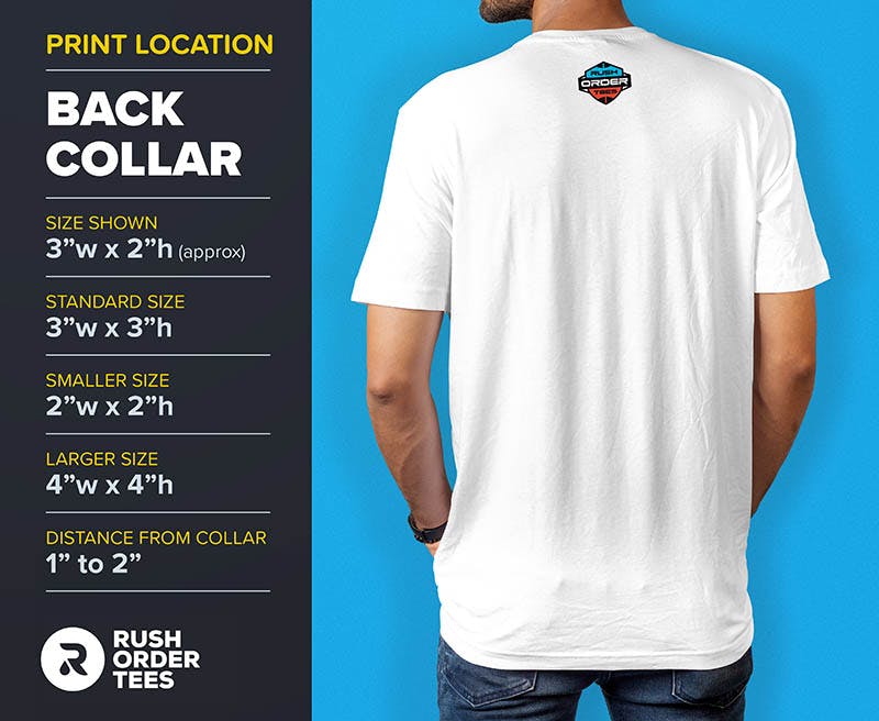
Pro tip: You can have a Full Back and a Back Collar at the same time, while only paying for a single back print. Set up the artwork so there is a space between the two designs (around 2 or 3 inches), and our print team will make the print placement high (near the collar). The rest of the design will end up where a normal Full Back would be.

6. Upper Back
This print location could just be called “Back” but the important thing here is that the placement is up across the shoulder blades.
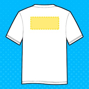
This is typically the location where you will see the bold words “SECURITY” or “EVENT STAFF” or perhaps the hashtag of the moment.
The size is usually 12” to 14″ wide to make sure people can read it from across the crowd. If your design is just a word, don’t worry about specifying Upper Back– we’ll know, and position it accordingly, around 4″ down from the collar.
Occasionally we have customers that want this printed across the bottom of the shirt (or butt area). It’s an option for promotional tees. While this area does tend to draw the eye, it doesn’t have near the visibility as the Upper Back area.
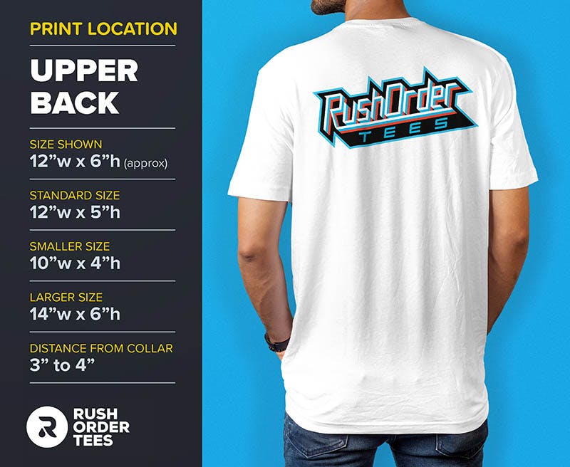
Pro tip: If your design is at the maximum width and the type still doesn’t look big enough for you, consider using a taller font (rather than stretching the font to be taller, which distorts it and makes it less legible). Look for any font with “Bold Extra Compressed” in the title, or a font that is naturally tall, such as “Impact”. Or just submit this request to our Art Dept and we’ll pick one for you.

7. Full Back
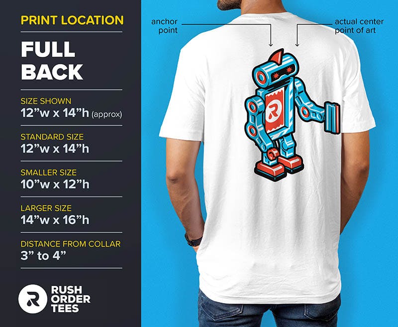
The Full Back is a classic and the second-most-popular print location after the Full Front. But it’s printed slightly lower and usually larger.
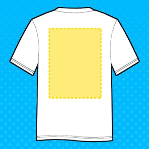
Usually, the standard print size of 12” wide by 14” high is plenty big enough, but we can go up to 14.5” wide by 16.5” high if required– and if the garments aren’t too small.
This print location rarely exists on its own. It’s usually complemented by a print on the front, sleeves, or all of the above.
For a classic combo, the Full Back pairs best with a Left Chest. You could say it’s the Big Dipper to the Left Chest’s Little Dipper. If you were looking for an astronomical analogy.
When you want an extra-large print, the Full Back should be your first choice. You can get away with a bigger image, as it makes a much better billboard than the front.
It’s also the place to put your most colorful and elaborate design. Save the simplified, single-color prints for the Left Chest and Sleeves.
Pro tip: If you’re making T-shirts for an event and have a bunch of sponsor logos to be printed on the back, sponsorship levels are often represented by tiers. The logos at the top of the shirt are larger and more prominent, representing the highest-tier sponsors, with the logos below that being smaller, and the ones below thart smaller still, and so on. Our Art Dept can help you arrange the logos into tiered groups.

8. Sleeves
This list would not be complete without the Sleeve. This can vary, so make sure you describe what you want if it’s any different from standard.
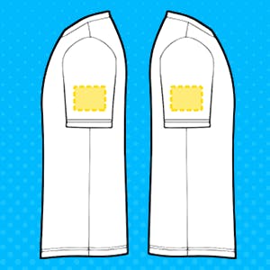
Similar to the Left Chest, reserve this print location for more simplified artwork. And like the other locations, the size and placement should depend on your particular logo or design.
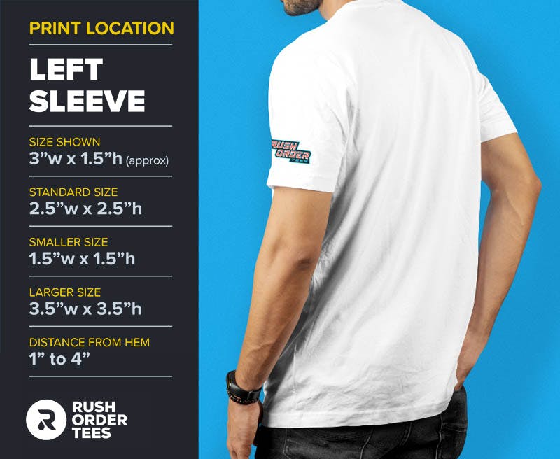
The Sleeve, in particular, looks best with a smaller print size. The standard is around 3” wide, but we can go as big as 4.5” wide (not recommended unless your logo is very wide), or as small as 1” wide.
Standard placement is about an inch from the hem. We have seen some great designs that are printed larger and up closer to the shoulder. Use your discretion on this location and don’t hesitate to ask one of our project specialists for help.
Pro tip: If you’re also printing a Left Chest on the same shirt, choose a Right Sleeve print to balance it out. If you’re also printing a Full Front or Center Chest, either sleeve will work. Bonus tip: An American flag on either sleeve should always have the stars facing towards the front.

Now that you’re a print location expert, are you ready to set up your design perfectly? Check out some of our most popular, high-quality T-shirts below, and get started now! You can always save your design for later.

Imri Merritt
About the Author
A graduate of the Multimedia program at the University of the Arts in Philadelphia, Imri Merritt is an industry veteran with over 20 years of graphic design and color separations experience in the screen printing industry.
