
Hat logo size and placement are a bit like underwear (bear with me) — ideally, people shouldn’t notice them, and if they do, there’s probably a problem. Logos should look natural, intentionally positioned, and proportionate so they show clearly despite having a relatively small printing area.
If you’re designing a custom hat, it’s important to know as much as you can about logo sizing and positioning first. If the logo is too small for the space, it won’t be noticeable; if it’s too intricate, it may not show up right. Plus, there are nuances to consider for elements like color scheme, texture, hat style, and alternate logo placement opportunities.
To make sure your cap looks great while displaying your logo as effectively as possible, read through this guide to hat logo size and placement first.
Hat Logo Placement Considerations
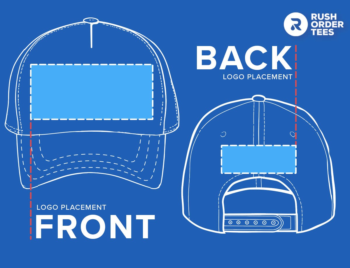
You might be tempted to jump straight into hat design, but first, you should get familiar with the logo placement elements you’ll run into. Having a plan for each of these should help you design the best possible headwear.
- Location: The most common location for a logo is the front, but you’ve also got the back available on some styles, and potentially even the sides.
- Position: This refers to how the logo is placed in the location of your choosing — usually centered, but it can also be set asymmetrically.
- Area: This describes the overall dimensions your logo can occupy in the location you set it in.
- Bounding box: Within the Design Studio, this box represents the boundaries your logo has to fit inside.
- Logo size: This is the measurement of the logo itself, which will fill, at most, the designated logo area.
- Anchor point: This is the point on the logo that will be centered within the selected printing area, which doesn’t have to be the exact center of the logo.
- Print options: Depending on the hat, you can choose between embroidered or screen printed logos. Embroidered logos are stitched, giving them a more textured feel that sacrifices fine detail. Screen printed logos have more detail since they’re printed directly on the garment, but they’re susceptible to fading over time.
For more detailed explanations of common printing location lingo, see the RushOrderTees printing terminology guide.
Logo Sizing and Placement by Hat Style
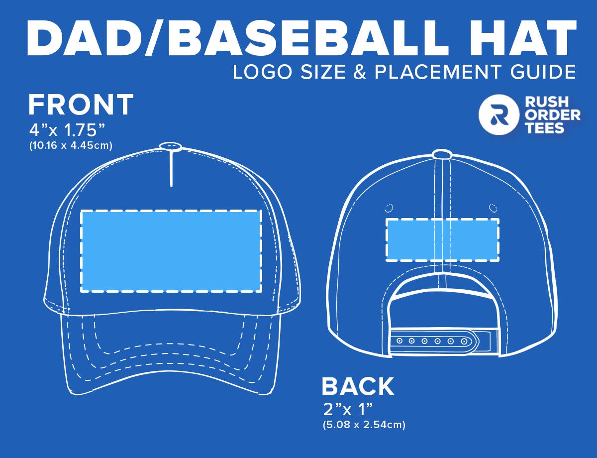
The size of a logo isn’t one-size-fits-all. While there is no single standard hat logo size, generally you can expect logos to max at roughly 4” x 1.75”. Either of these dimensions vary, but anything under that should fit on many hats. Keep in mind that the available logo area can change depending on the style of hat you choose, and for more intricate designs you may want to take advantage of larger spaces to ensure all the detailing can be seen Here’s how some popular hat types differ for logo placement.
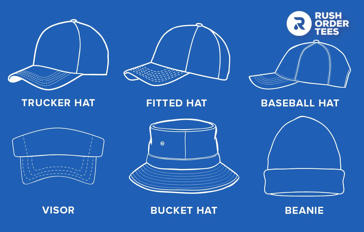
Baseball Cap / Dad Hat
Whether you’re a fan of America’s pastime or just its quintessential apparel, the classic baseball cap is still one of the most popular hat styles out there. With its low profile, flexible build, and relaxed structure, it’s ideal for logos that can handle a little movement since the logo area tends to wrap to fit the wearer’s head.
Dad hats have a similar profile to baseball caps and generally identical logo area dimensions. However, dad hats don’t have a front lining like most baseball caps, and typically have unstructured crowns. But, like baseball caps, dad hats are good for text designs that can handle the hat’s contouring, or for somewhat smaller logos.
Pro tip: Baseball caps are casual, comfortable, and flexible by design, making them ideal for informal, simple designs and quippy messaging. Try adding text to the front and tagging the back with your logo.
Trucker Hat
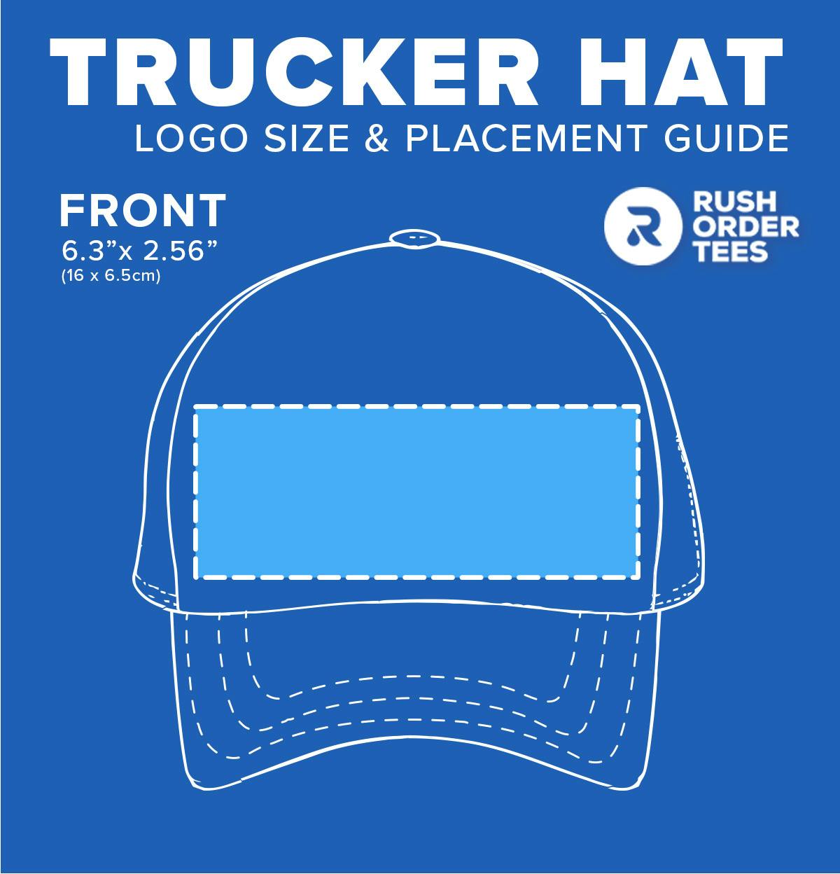
Defined by their signature six-panel structure with side and rear mesh, trucker hats are the ultimate casual cap. While some trucker hat options have lower profiles like baseball caps, others feature higher, broader fronts with much larger logo areas. Generally, trucker hat logo sizes are among the biggest of any hat style.
The main drawback to trucker hats is that their partial mesh construction makes it impossible to include a rear or side logo. But if you’re looking for a laid-back cap with plenty of front real estate for your design, consider these.
Pro tip: With a more self-aware style that nods to blue-collar work attire, trucker hats are a great choice for promoting more tongue-in-cheek messaging and informal aesthetics. If you want to go big with your design, pick a trucker hat with a high profile, and consider a foam front to give it a real throwback look.
Fitted Hat
Technically, just about any style of hat could be a fitted hat, but they’re worth digging into as a separate style. Fitted hats have no size adjusting mechanism on the back, meaning they’re entirely enclosed. This gives them a more polished look, but they may not be the best choice for promotional items since they aren’t universally sized. On the flip side, their enclosed backs lend a more versatile area for rear logo placement.
Note that while the other classes of hats on this list can also have varying logo size depending on the brand and individual product line, logo areas for fitted hats can vary widely since they can apply to just about any construction.
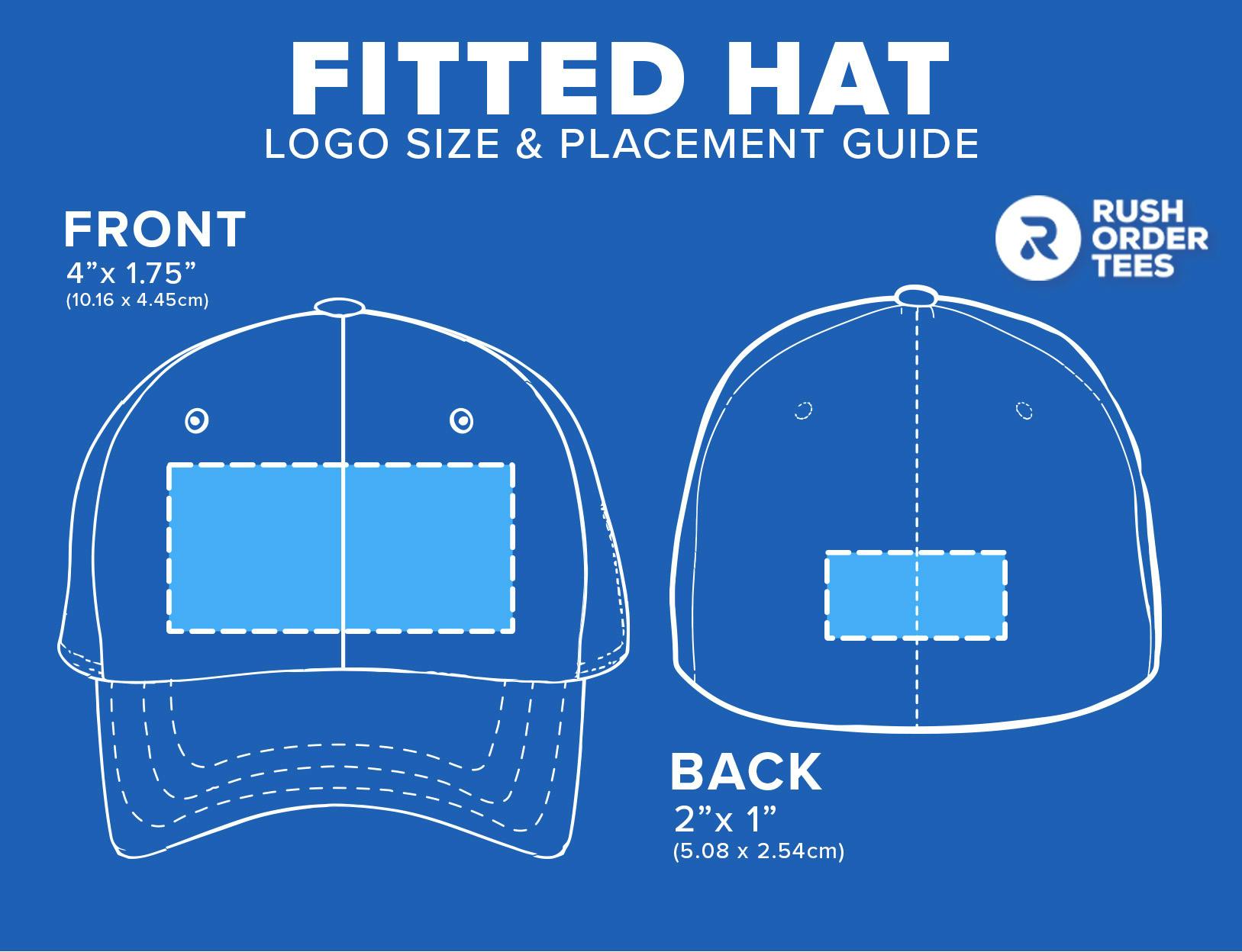
Pro tip: Pick fitted hats if you’re able to stock multiple sizes, and consider options with flexible bands for less rigid sizing options. These are a good choice if you want to make the most of the rear logo placement opportunity while maintaining a more uniform look across the front, sides, and back.
Visor / Golf Hat
For those who want to both protect their eyes and preserve their hair, a custom visor checks both boxes. Designed for outdoor recreation — especially as golf headwear — visors are lightweight and have minimal coverage, helping wearers keep a cool head. These often have a self-fastening back, leaving no room for a rear logo. The front also has a fairly limited print area, so if you’re adorning one of these with your logo or messaging, you’ll want to plan for a relatively small rendering that doesn’t leave much space for fine detail.
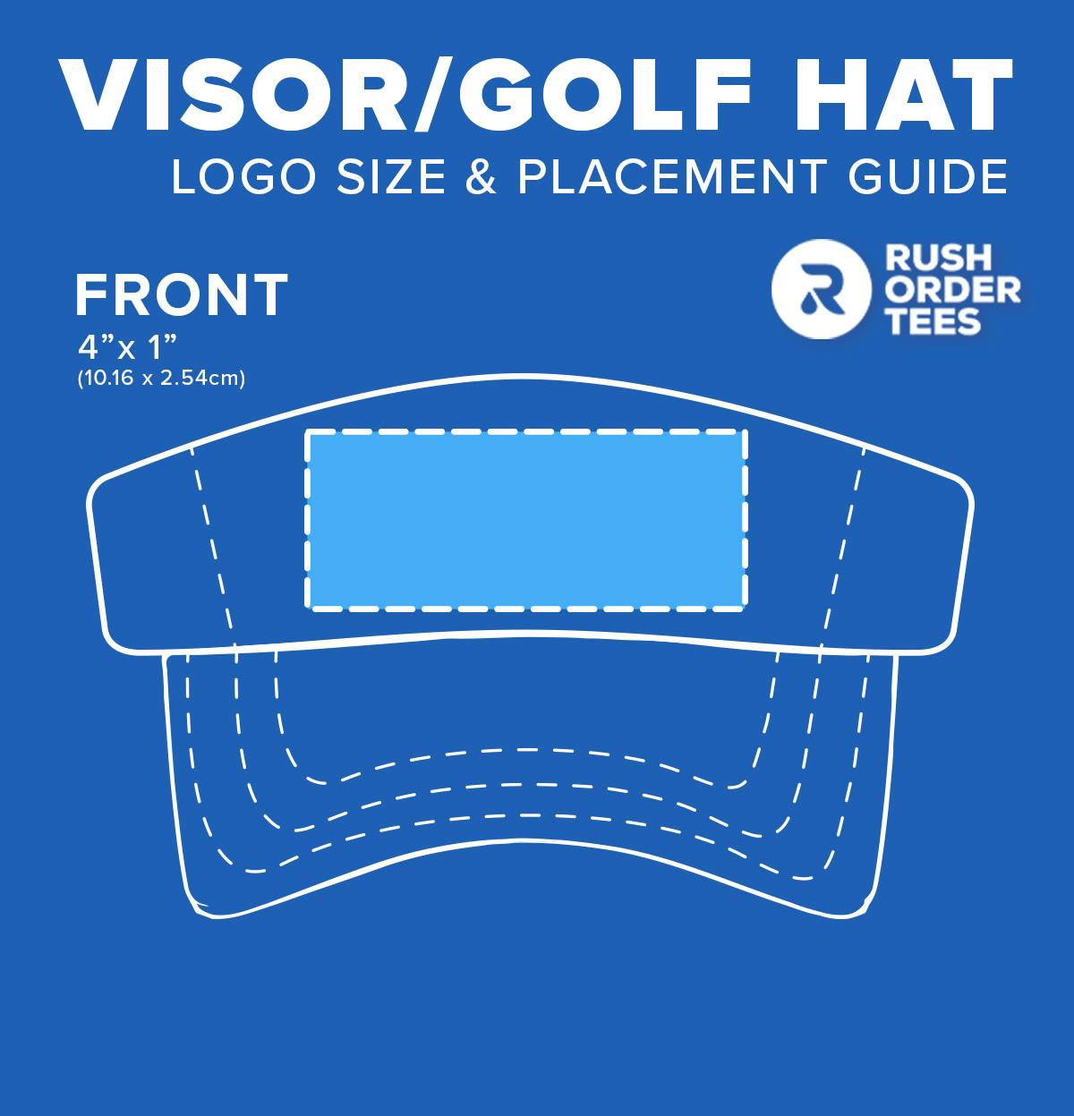
Pro tip: Visors are best suited for outdoor activities and don’t leave much room for design, so keep your logos small and your messaging brief. If you’ve got a more intricate design in mind with detailed visuals, consider making a simplified version to upload.
Bucket Hat
Bucket hats occupy a unique space in the headwear landscape: they’re utilitarian garments that offer maximum protection from the sun as well as fashion statements riding the trending wave of 90s nostalgia. In either case, they’re great for custom designs because they boast a 360-degree canvas with plenty of room for logos.
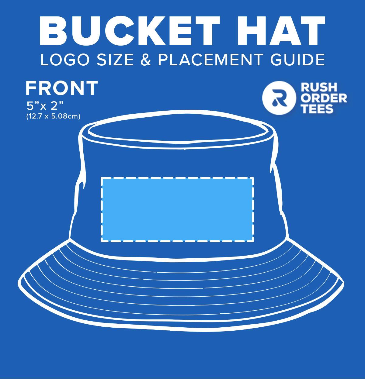
Pro tip: Pick a bucket hat if you’re looking for a casual, functional hat for outdoor crowds or trendy, younger people. These are great for informal messaging and quirky logos, particularly if you want to take advantage of a larger printing area.
Beanie
No wardrobe is complete without a beanie or two (or three, or four). On a practical level, this versatile headwear is great for colder climates where they can be worn through the winter; on a style level, they make a great accent for just about any casual outfit. Generally these only have space for front logos, which tend to be on the smaller side.
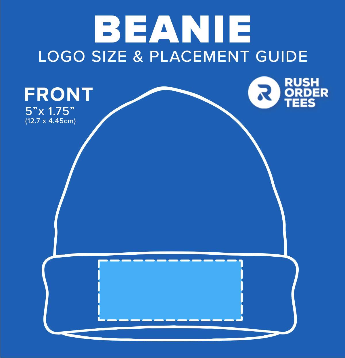
Pro tip: There are a lot of ways to fashion a beanie, which means wearers may fold the band over the logo. Consider using a fun message or aesthetically compelling design to ensure your artwork doesn’t get lost in the fold.
Preparing Your Logo File for Upload (Or Designing From Scratch)
At the end of the day, the image on your hat is only as sharp as the file you upload to the Design Studio. That’s why understanding the logo file upload process isn’t just important; it’s vital.
Step 1: Consider Design Software
If you’re planning to add a premade logo to your hat, it’s worth using design software to edit and package the file. This will give you the most flexibility and customization tools.
Adobe products like Photoshop and Illustrator are industry standards, but there are plenty of inexpensive (and even free) alternatives. If you’re looking for a quick option with a low learning curve, you can also use browser-based apps like BeFunky and Pixlr to prepare your file.
If you want to jump right into design with no experience, you can also use the RushOrderTees Design Studio to write text, apply clipart, add new images, or just position an existing file.
Step 2: Pick Your File Type
Not all image file types are created equal. Our Design Studio, for example, accepts these formats:
- .ai
- .eps
- .tiff
- .psd
- .jpg
- .png
When you access your logo in your chosen third-party design software, you should be able to export your image file as any of these types. You might be tempted to default to .jpg if it’s what you’re used to, but designers often recommend .tiff and .png because they render more sharply.
Step 3: Choose Your Hat
When you’ve got your design file (or at least the design concept) ready, you’ll need to find the right custom hat for your logo. Different hat styles — and even different brands and makes within those styles — can impact your logo placement possibilities.
As you browse hat options, consider how the style will complement your design and relate to your market. If you’re expecting it to be worn on the golf course, you’re probably not considering a beanie. If you’ve got a relatively detailed design and a secondary logo, look for caps with larger placement areas and a spot for a rear logo.
Step 4: Access Design Studio
After you pick your hat’s color, click the “Start Designing” button to — you guessed it — start designing your hat in the Design Studio. Here, you’ll be able to:
- Add text and customize it in real time
- Upload an existing logo and reposition and resize it
- Add clipart to supplement your design
- Toggle print vs. embroidery (if applicable)
- Add design elements to the back of the hat (if applicable)
- Use our Design Wizard to create a custom logo on the fly
- Add and edit multiple products within the same suite
- Include additional design notes
Step 5: Finalize Your Design
When you’re happy with your design, you can move ahead by clicking “Next Step” in Design Studio. If you’re not ready yet, you can save it to review later or get a second opinion from your teammates. Enter the quantity you want of each size and make sure they add up to the minimum quantity, if there is one.
Moving along to the pricing page, you’ll see a quote for your quantity broken down by per-unit prices that get lower as your quantity increases. Add the hats to your cart, and you’re ready to check out.
Tips for Custom Hat Logo Sizing, Placement, and Design
After sinking all that work into your personalized hat, the last thing you want to see when you open the delivery box is an off-center logo with the edge cut off. Here’s how to make sure your design shows up perfectly.
Scale and Center Your Image
Remember that the sizes mentioned in this post are general — there are hundreds of hat options out there, and the one you pick may vary slightly. If you’re bringing a logo file into the Design Studio that’s already been scaled according to specific physical dimensions, you’ll still want to make sure it fits the hat you chose.
Once you upload your file and adjust its placement on the hat, the bounding box will show you a visualization of the boundaries you’ll want to keep it within. Here’s how to get your logo properly sized and centered:
- If your logo is too big, scale it back so each side fits within the bounding box, and then recenter it by dragging it back toward the vertical middle line until it snaps into place.
- If your logo looks small, it may be worthwhile to redesign it within your original design software to make it bigger — stretching a small image may pixelate or obscure it.
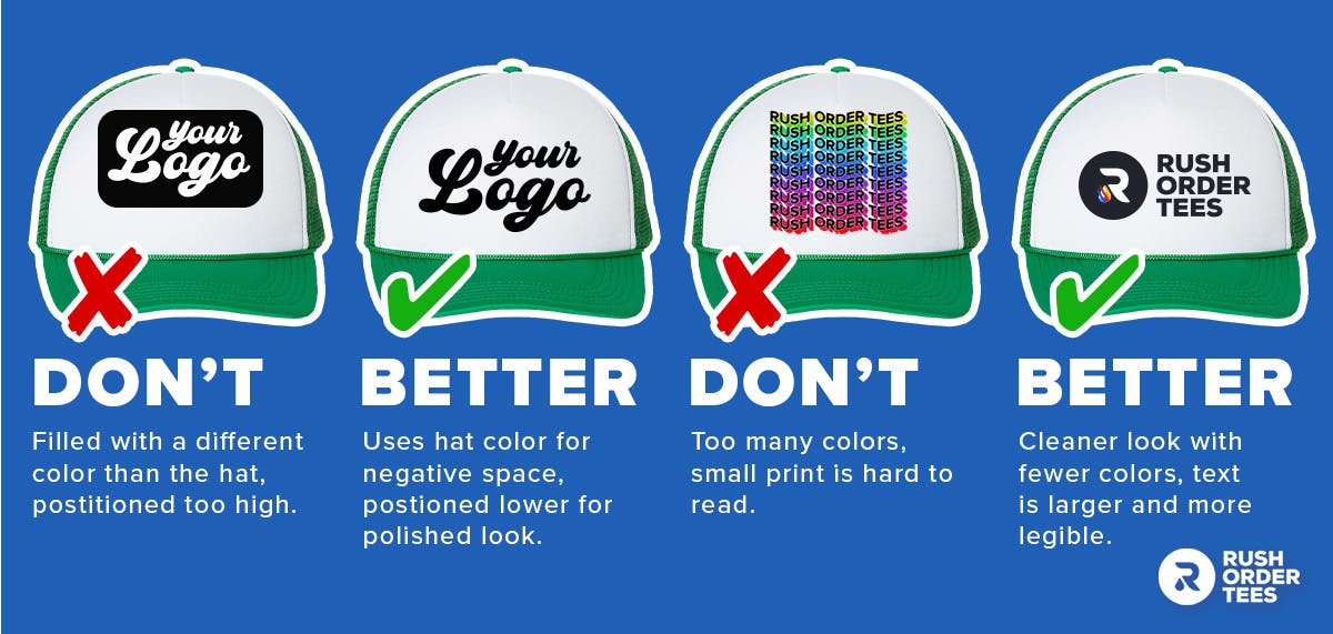
- When it comes to vertical placement, start by centering the image and placing it at the bottom of the bounding box. Best practice is usually to keep the logo low (toward the bill).
- If you’re stretching your logo to make it bigger, start by positioning it at the bottom of the bounding box and then stretch it to your desired height, then re-center it to the vertical middle line.
Less (Detail) Is More
Not to state the obvious, but remember, a hat is not a t-shirt. Hats are somewhat unique when it comes to logo design because they’re smaller than most other garments and have no truly flat or rigid surfaces.
That means it’s best to strip down some of the detail if you’re working with a complex design. This is especially true if your design is going to be embroidered rather than screen printed, which can limit the color options and level of intricacy.
That doesn’t mean your design has to be boring. Here are a few ways to keep it simple while ensuring it still pops:
- Use negative space rather than coloring or shading large areas
- Try to keep the logo as large as possible within the logo area
- Consider re-rendering your design as a simple line illustration
- Consider alternate logos from your branding library with less detail
- Keep text short so you can increase the font size
Consider Your Colors
Similarly, a hat may not be the best place to display your painstakingly designed Dutch Renaissance-style logo.
Again, embroidery has a lot of limitations when it comes to showcasing dynamic color — in fact, many hat styles have limitations on the number of thread colors you can use. Even if your hat of choice allows unlimited thread colors, the nuance of a complex color scheme may not translate very attractively.
For screen-printed designs, you’re still limited by a small surface area, so too much color can look busy or get washed out (figuratively and literally).
To help you get the most out of your potentially limited color options, consider these tips:
- Avoid using really short gradients, which may not show up.
- Complement your logo color with the hat color to help it pop.
- Use negative space to let the hat color fill in the gaps.
- Don’t apply a separate color to negative space.
- Avoid dynamic coloring like sparkles, shading, or metallic gloss.
Hat Logo Size Made Easy
Custom hats are perfect for apparel shops, events, company swag, or even your own wardrobe. They may be a bit more particular than other custom apparel options, but once you get the basic best practices down, the process is pretty simple.
RushOrderTees makes the process even easier with its Design Studio and convenient shipping options that fit your timelines. Whether you’re looking for branded apparel, novelty items, office supplies, or tech gadgets, you can customize just about any promotional product in a matter of a few clicks.

Bryce Emley
About the Author
Based in New Mexico, Bryce Emley is a seasoned content writer and expert in the realms of custom apparel and eCommerce. Holding an MFA in Creative Writing, he seamlessly blends his passions, specializing in insightful content that bridges the gap between innovative apparel solutions and digital commerce trends. Beyond his professional pursuits, Bryce is an avid creator, channeling his creativity into poetry, screenplays, and creative nonfiction. In his leisure time, he has a penchant for collecting unique, vintage anime t-shirts, showcasing his love for both rare finds and the artistry of apparel design.
