The Distress Effect: How To Create a Vintage Look for Your Custom T-shirt

November 14, 2022

DESIGN

The Distress Effect: How To Create a Vintage Look for Your Custom T-shirt

November 14, 2022
Distress may sound like a terrible thing, like something you feel at the DMV or a call you make when you’re lost at sea. But in the T-shirt business, it’s a desirable effect for designs and a trend that has persisted for over 15 years now– with no sign of going away anytime soon.
In this post, I’ll explain what it is, how it works, why it’s so popular, and then give you some examples you can download and some instructions for doing it yourself.
Ready to get distressed?
The Vintage T-Shirt Look
This is essentially what we’re talking about. Recreating the aged look of an old school, worn out design that has been washed so many times the ink has been cracking and chipping off for years. It’s vintage without the old sweat stains.
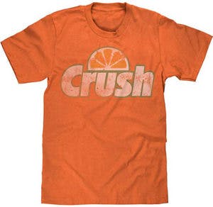
You may have seen “distressed” jeans at the store, complete with faded, worn out parts, and even holes. As counter-intuitive as it may seem, people pay extra for this look. Who has time to wear jeans for 20 years to do it themselves?
When it comes to T-shirts, this distressed effect is everywhere. From band merch to sports merch to funny and ironic tees, you name it. So what’s so great about making something look old? People crave authenticity and look for it in brands, but there’s more to it than that.
What does the distress effect accomplish other than looking cool?
• Less ink and thinner ink gets put down onto the shirt, resulting in a softer “hand” or feel.
• Tiny breaks in the ink layer keep the print itself flexible, draping naturally with the fabric.
• The fabric itself is more breathable in the print area, because there is less ink clogging up the fibers.
Any design can be made to look vintage
What some people might not realize is that the distressed effect can be applied to any design. That doesn’t mean you should do it, but you can.
Some designs lend themselves to a distressed effect, others are not really suited for it. Vintage corporate, anyone?

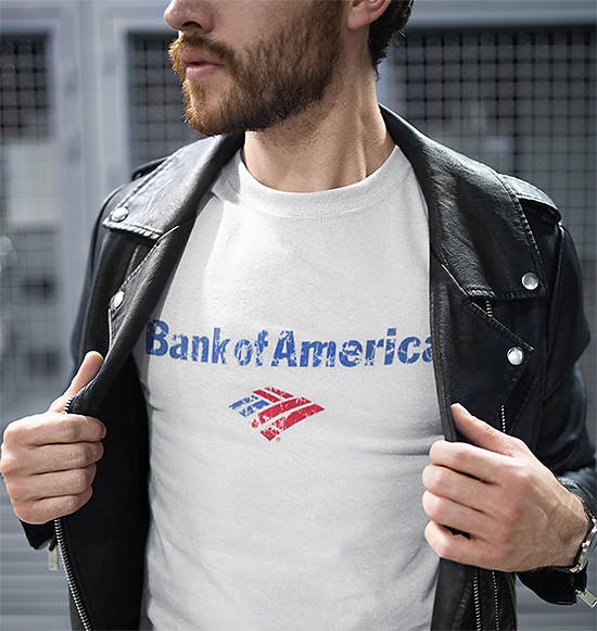
And then some designs are just screaming out for it to the point where it wouldn’t look right without it. For example, if vintage is in the title.
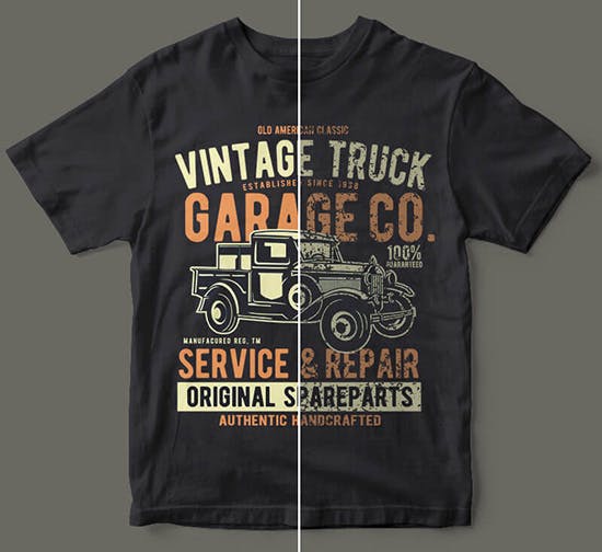
Various Ways To Do a Vintage Look on Tees
There are multiple ways to accomplish the effect, from the print method, the print technique, the inks used and of most importantly, the way the file is set up. Let’s look at each one of these approaches.
Print method
Digital printing or Direct-To-Garment (DTG) printing lends itself well to the distressed look because the print is normally not as vibrant a screen print. The inks are waterbased and not very thick, so the print will have a soft “hand”.
Print technique
If you’re going with screen printing (actual vintage T-shirts were screen printed because they didn’t have DTG printing in the ’70s), there are a couple things you can do to achieve the vintage look.
One is to thin down the ink, with an additive such as Finesse. The other, for dark or color garments, is to omit the underbase. Without an underbase, the print will be much less vibrant.
Inks used
With screen printing, you can opt to use water-based inks, which are naturally thinner. And you can use discharge ink for the underbase. Discharge works by knocking the dye out of the fabric, making the print much less thick and heavy.
File setup
Finally, and most importantly, file set up is where you can really add the style to your artwork to ensure a distressed look before it even goes to press. You essentially take a distressed texture, map it into your artwork, and knock it out of the design.
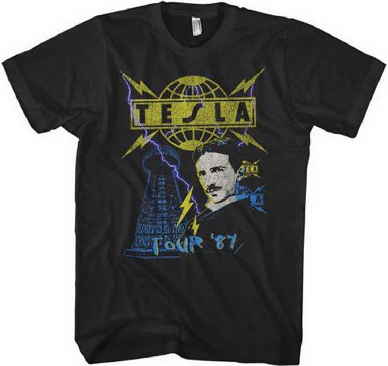
Below I’ll show you some examples and also provide a few files you can download for your own custom distressed T-shirt designs.
Example Process for Creating a Vintage Look
Original Design
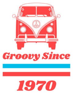
Here’s the groovy design we’re starting with, on a plain white background. To see a larger version of any of the following images, right-click and choose “open image in new tab”.
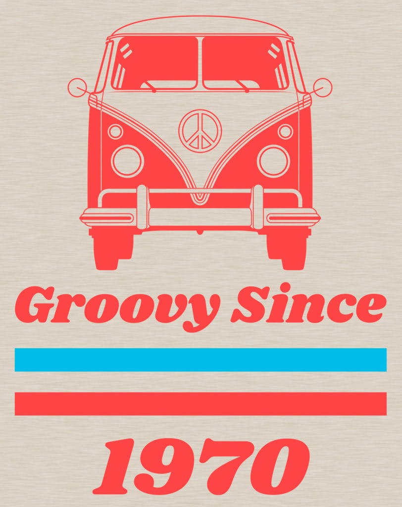
Choose a vintage-style shirt
First, let’s pick a nice natural T-shirt color with blended fabric for a heathered look and a soft feel.
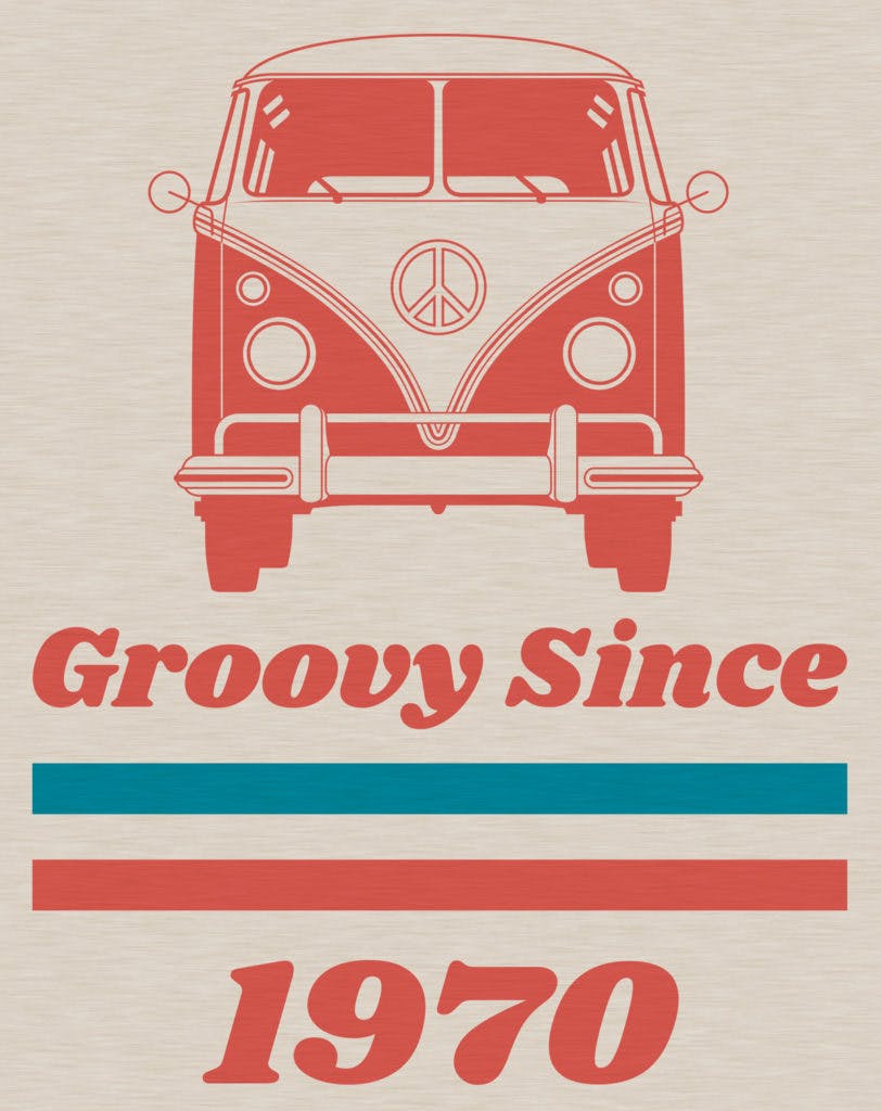
Use Less-Vibrant Ink Colors
Next, the colors above are too vibrant for a vintage look. So we’re going choose colors that are toned down, and then I’m simulating water-based ink, or thinned-down Plastisol (notice that you can see a little bit of the heathered texture of the T-shirt through the color).
Now we’re looking good on the shirt and the ink colors, so it’s time to add the distressed effect.
There are literally thousands of distress textures out there on the interwebs, and the number increases to infinite because you can make your own out of any texture.
I’m going to show you four different examples.
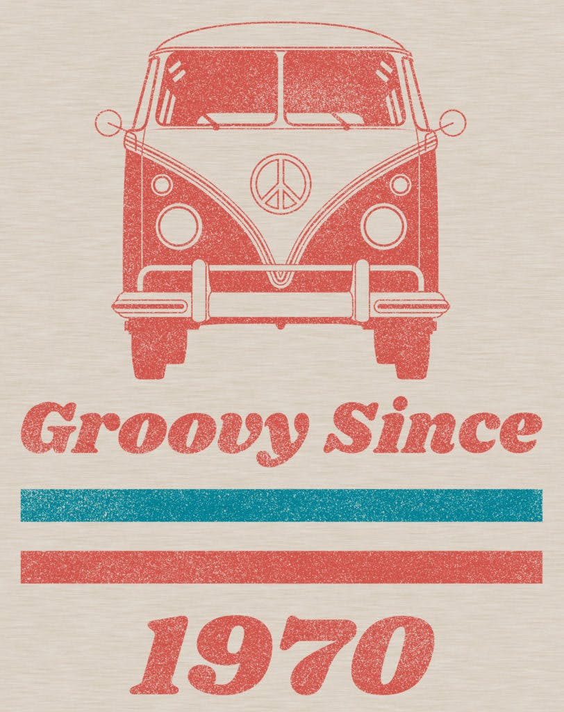
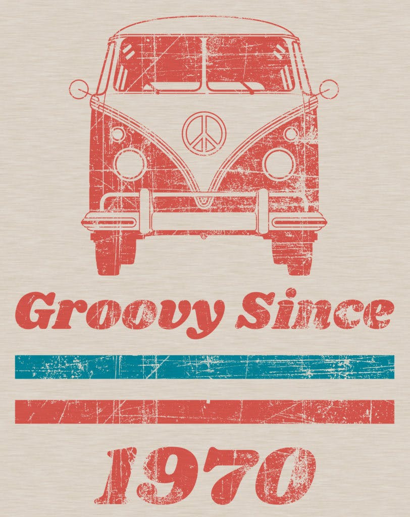
1. “Noise” Distress
This particular distress we’ll call “noise” and it gives the effect of a print that is fading away from hundreds of washes, road trips, and sweaty concerts. Something like this would be my pick for this particular design.
2. “Wearout” Distress
Here’s the same design with a distress file we’ll call “wearout”. It has the same effect of an old screen print, but with bigger chunks worn away for a natural but more stylized effect.
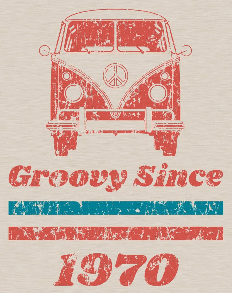
3. “Grunge” Distress
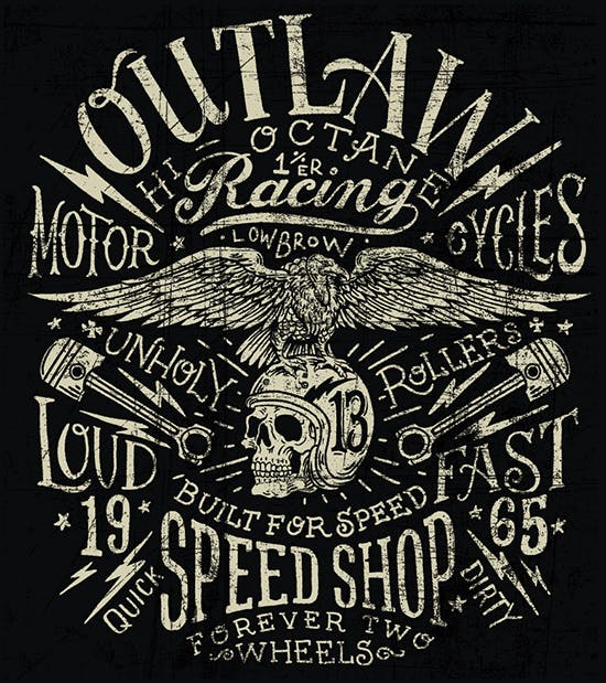
And here’s another one, we’ll call “grunge” and it has an even more stylized effect, but now we’re getting away from a realistic faded looking design. This one might be better suited for a punk band or motorcycle garage.
Much better for something this.
4. “Default” RushOrderTees Distress
Finally, we’ll look at one we’ll call “default” because its the standard distress effect that is built into our Design Studio. You can try this one out on your own design right now and see how it looks.
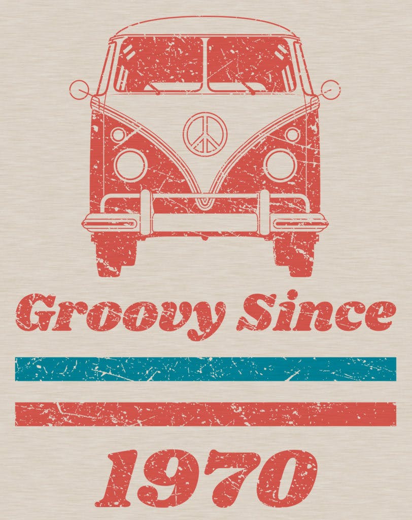
Our default has got kind of a rugged look, like a shield that’s been through battle. This works well on many designs, but if it’s not the best fit for yours and you want something different, just let your sales rep know what you have in mind.
If you’re placing your order online and would like us to create a custom distress effect for you, just include a detailed request with your order and our Art Dept will take care of it. We have plenty of these textures at our disposal and will make sure it suits your design or brand.
Is there such a thing as too much distress?
Just like anything else, there is a balance to be achieved. You want it to look aged and worn, but not so much that you lose the image. Pay special attention to any small type and make sure it’s still legible.
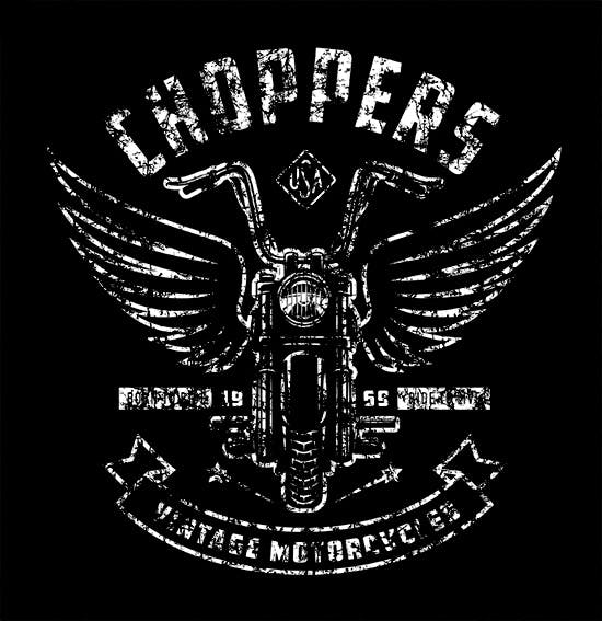
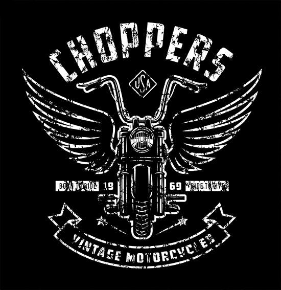
In both of the examples above, applying more ink won’t help the situation. Because the parts of the design needed to make it legible are literally missing from the art file.
So how do we avoid over-distressing a design?
PRINTER’S PRO TIP: Apply the distress effect to just the underbase to achieve a subtle and authentic vintage look
I’ve used this trick many times and it works very well.
The top screen (or “highlight”) would have the full design with no distress. Or vice versa. Either way.
Here is an example of what that could look like with the same design. The white ink is thinned down and printed lightly for both the underbase and the highlight. It would also help to use an off-white or light gray color.
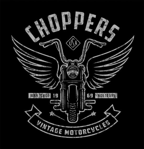

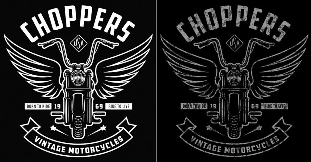
If you know your way around Photoshop and want to try out any of the example textures I used for this post, here they are. In a future post, I will go into more detail about how to do it yourself in Photoshop.
You can also try this free online tool called Photopea. It works just like Photoshop, so it’s a great alternative to Adobe if you don’t have the bucks to drop on that right now.
Right-click or option-click to download and save to your computer.


Happy designing!
-M

Imri Merritt
About the Author
A graduate of the Multimedia program at the University of the Arts in Philadelphia, Imri Merritt is an industry veteran with over 20 years of graphic design and color separations experience in the screen printing industry.
