
Every company needs company shirts. Full stop. From the smallest startups to the biggest corporations, company shirts provide a lot of value to your business: legitimacy, professionalism, branding, and, if done right, style points. Employees get an upgraded look, along with team cohesion and the feeling of being valued. Plus, hey–a free shirt.
But what makes a great new company shirt? And where can it go wrong?
If you’re in the market for custom company shirts, this post provides all kinds of info and design advice. Here are the 6 tips that will ensure you create company shirts you’re proud of:
- Select a garment that fits your needs
- Pick the best colors for the job
- Print your logo in the right locations
- Choose a message that works
- Create an appealing design
- Consider sizes and quantity thoughtfully
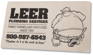
Example order: Company work shirt for Leer PlumbingWe’ll apply each of these tips to an example company T-shirt order for a plumbing business that is entirely made up. We’ll put together a typical order that would also work for landscapers, janitors, auto repair, and many more. Look for these highlighted example sections in each tip!
1. Select a garment that fits your needs
Your first choice is probably the most important one: the garment. It’s what you and your team will wear proudly to represent the business. And most crucially, if they’re uniforms, wear them every day at work.
Choose a garment that hits the trifecta: appropriate, comfortable, and looks great.
There are three main types of company shirts: to customize: T-shirts, polos, and button-up/dress shirts. You have many options– including fabric type–which can make the choice seem daunting. The easiest way to narrow it down is by asking the following series of questions. The answers will guide you to the type of garment that’s best for your needs:
Questions to determine the garment that fits your needs
- What is the purpose of these shirts? (Uniform, promotional, casual attire, gift, etc.)
- Who will wear them? (Executives, middle management, laborers, etc.)
- How often will they be worn? (Every day, single event, special occasions, etc.)
- Under what conditions? (Outdoors in the heat? Or temperature-controlled environments, etc.)
- What is the budget per shirt? (Can you afford to get premium quality, etc.)
Company T-shirts
The humble T-shirt is always a great option when you’re looking for something simple, casual, and inexpensive. It’s also the top choice for tradespeople, laborers, and other hardworking employees. Nothing beats the comfort and durability of a classic short sleeve tee, whether it’s plumbing, auto repair, waste management, or other dirty jobs.
A T-shirt is also great for a more casual office environment (including the most casual of all–working from home). From struggling start-up companies to giant tech corporations, you can find T-shirts as the office attire of choice.
For construction, landscaping, events, and other outdoor jobs during the summer, choose a lightweight performance tee or cotton/poly blend, which will help regulate temperature and dry faster. Long sleeves can help block harmful UV rays.
Customization method: Screen printing or digital printing
Company Polo Shirts
Next, we have the classic polo, a T-shirt with some extra class. Polos (aka golf shirts) come in a variety of materials and cuts, and they all share a soft collar and a few front buttons for the unmistakable combination of professional, casual, and sporty. Everyone looks great in a polo, and they pair with jeans just as well as slacks.
Customization method: Embroidery or heat-transfer patches (left chest and/or sleeve)
Company Button-up Shirts
Our third category of company shirts is the long sleeve button-up, the dressier side of business casual. A superb choice for executives, managers, office workers, or for the customer-facing side of businesses such as uniforms for retail, outside sales, customer service, restaurants, bars, and special event workers like caterers, photographers, etc.
Customization method: Embroidery or heat-transfer patches (left chest)
Click on the images above to get more info on their product page. They are just a small sample of the items we offer. Get in touch if you can’t find what you need on our website. We are experts at finding the right garment for your needs.
Example order: Selecting a garment to fit the needsOur example order is for a fictional plumbing company called Leer. They come to us with a basic logo and are looking to outfit their employees with some new T-shirts they can wear on the job and represent the company with pride. Let’s use those questions to help determine the best garment choice.The purpose? To be a work shirt/uniform.
Who will wear them? Laborers.
How often? Every day.
Under what conditions? Sometimes hot.
What’s the budget? Mid-range.
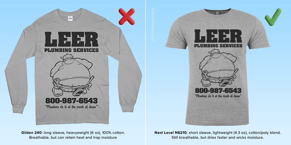
Let’s say they start their order with a standard 100% cotton long-sleeve: the Gildan® 240. Is this the right T-shirt?While a cotton is a good fabric option for its comfort and breathability, and Gildan is on the cheaper side, this item is 6 oz fabric weight (per square foot), which is on the heavier side. That means it can get hot. And with cotton being moisture-absorbing, it can get sweaty.The long sleeves don’t help either, as they trap heat and get in the way. Why would a plumber need sleeves? Big Jim’s crew members often find themselves elbow-deep in messy work.We’d recommend skipping the sleeves and heavy cotton. Instead, go with The Next Level N620. It’s a short-sleeved and lightweight (4.3 oz) cotton/poly blend, which dries faster than cotton. It’s pre-shrunk, has a tear-away tag, and comes in a variety of colors. More comfort, less sweat.For those more budget-conscious, the Hanes EcoSmart 5170 provides similar features at a lower price point.
2. Pick the best colors for the job
This is a more important decision than most people realize. From a marketing perspective, there’s an entire field dedicated to the psychology of color and how it affects consumer behavior. But take it all with a grain of salt and don’t go changing your brand colors–especially if they’re already well established.
There are more simple reasons for choosing certain colors over others for your company shirts.
Shirt Color
Consider the garment your first color choice, just as important as the ink choice. Keep in mind that some brands have limited colors available. Most shirts come in standard colors. Some shirts only come in a handful of colors or are heathered. Our top products come in a huge variety of colors. Check each product page to see what’s available.
Consider your ink colors at the same time you decide on a garment color. That way, you can plan your color scheme ahead of time and consider contrasting and matching. When in doubt, choose darker colors–especially if they will be work shirts. Dark fabric hides a lot of dirt and stains.
As a bonus, most people look better in darker, more muted colors. And for that reason, it’s wise to stay away from bright, bold colors. At least not the garment color.
Think about men’s suit colors. Not everyone looks good in bright red or orange, but everyone looks good in navy blue. So for example, if your company’s colors are red, orange, and brown, make the shirt color brown (the darkest and most muted) and the logo red and orange.
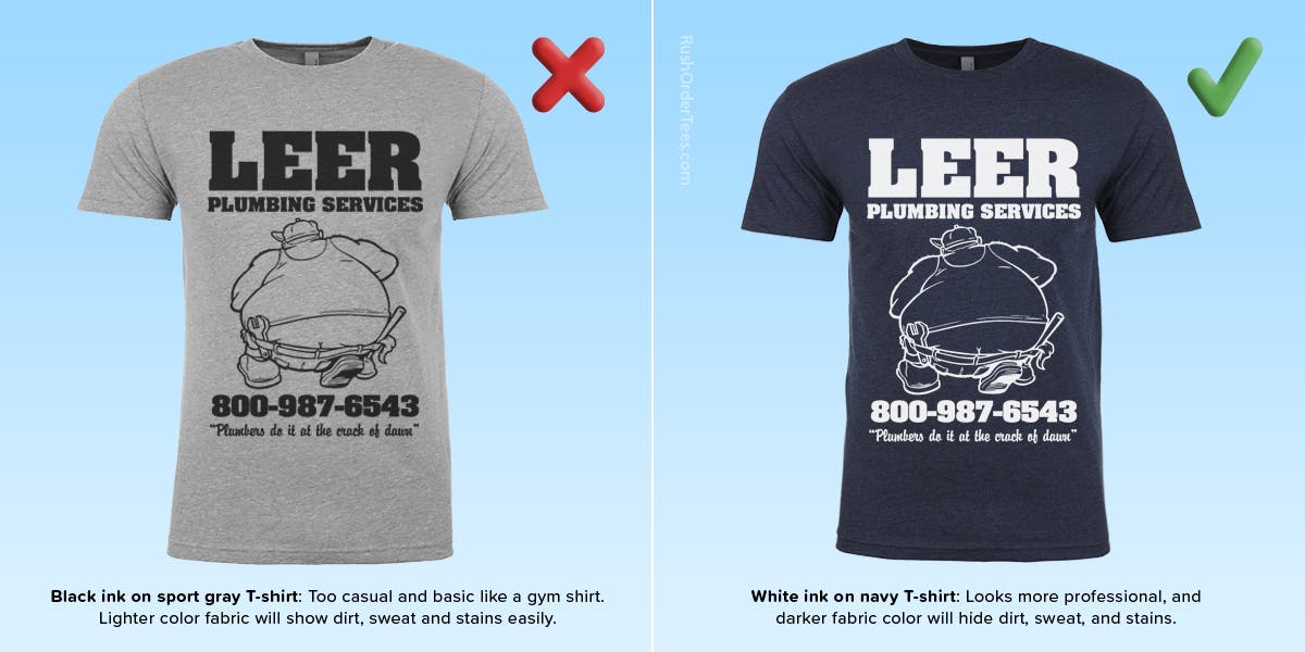
Example order: Picking the best shirt color for the jobFor Leer Plumbing, is heather gray the right choice for their employees? Plumbing is a dirty job, and on any day, a plumber can encounter all kinds of grease, grime, and things I don’t have to mention.Dirt or stains can be embarrassingly apparent on a lighter color shirt like gray, and especially white. No one wants to see that. Simple solution: Choose a dark shirt color. Let’s go with the classic and noble navy.
Ink colors: Full color vs. limited colors
Your other color choice is ink. You can choose to use a single ink color or a set of colors that represent your brand. We do offer full-color printing, and it’s easy to think: ‘the more colors the better!’ Not always.
Think about your target market or demographic. Going all out with color might be a good idea if you run a daycare center or a burger joint. Or if you have a logo that is only recognizable by its array of colors. But for most company shirt designs, less is more.
While it can be eye-catching, printing lots of colors can make your design look childish or unprofessional. Plus it typically costs more, and reducing colors will save you money on your order. And there’s another good reason not to go wild with the number of colors: the fewer there are, the more likely the shirt will match easily with the other parts of a person’s outfit.
Using halftones
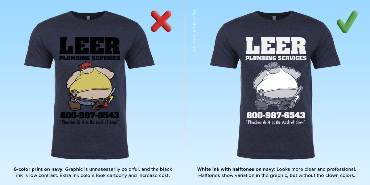
How about adding some varying tones of a single color? We can do that. They’re called halftones, and it’s basically just turning shades of gray into fields of different-sized dots that are so small that the human eye recognizes them as variations in tone.
Halftones are everywhere if you look close enough. You know what I’m talking about if you’ve ever peered at a comic book through a magnifying glass. The other nice thing is that they will take on a lighter shade of the shirt color they are printed on.
In this example of printing halftones of white ink on a navy shirt, we get lighter shades that look gray/blue. If there were also forest shirts in this order, the lighter shade would be olive. On a brown shirt, the lighter tones would be tan/beige.
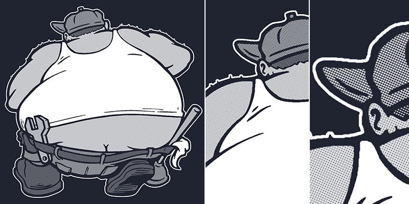
Halftones are relatively easy to accomplish on our end. They cost nothing extra and add dimension to your design, so why not? It also helps with definition, depth, and contrast.
Example order: picking the best ink colors for the jobOn the left you see the full-colors of the original plumber graphic. Here, it looks too cartoony and doesn’t serve any purpose. And since black ink will not contrast enough against navy, we’ll switch the ink color to white. On the right you can see that original image but inverted and printed with halftones.
3. Print your logo in the right locations
In choosing your print location, there are good reasons why the standards are standard–and we go into detail about that in a previous post about the top 8 print locations. It’s important to know them before trying alternative locations.
Business standard locations
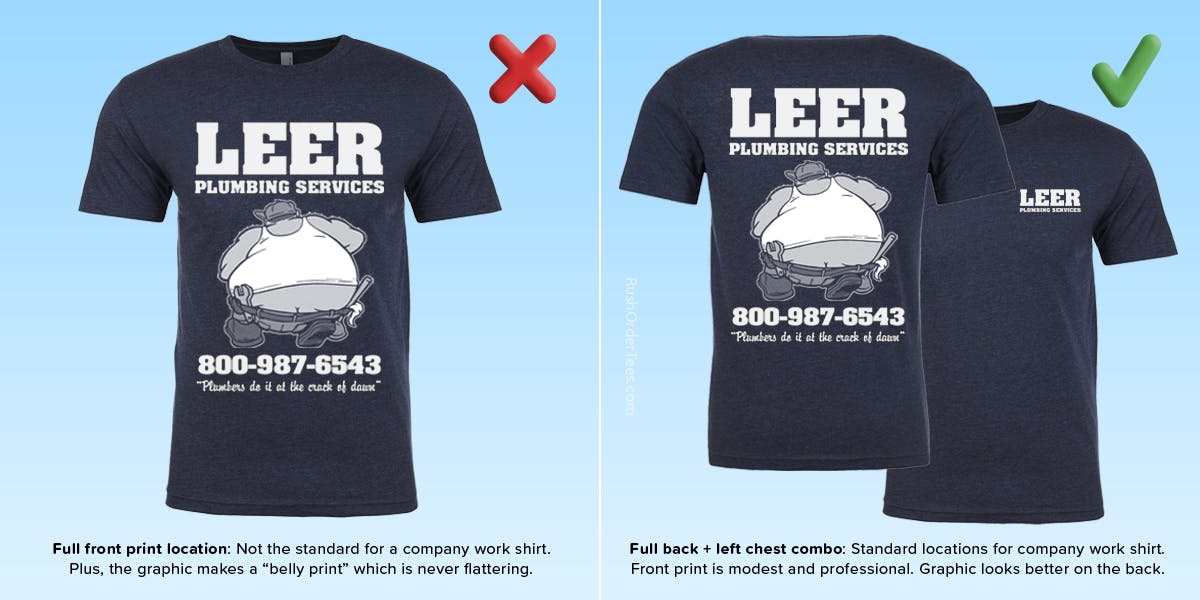
The standard for a company shirt like this would be the left chest and full back combination. The back of a tee tends to be better as an ad than the front, and in this case, for a plumber, it’s the backside that gets the most views (as shown in Big Jim’s cartoon character image), and the left chest is just the classic place to put your logo.
Embroidered left chest logo
For executives, sales reps, servers, and many more occupations, an embroidered left chest logo is the classy way to create a company shirt. It’s especially recommended for collar dress shirts, structured work shirts, and polos. It’s a bit more expensive than regular printing, but it’s still affordable–and nothing looks better or more professional.
Embroidered names on the right chest
An extra step in customizing these company shirts is to have your employee names embroidered on the right chest. This adds a personal touch and provides a head start on familiarizing customers with their names. Being on a first-name basis can go a long way towards establishing rapport–and getting better reviews.
Example order: print on the right locationsThe Leer Plumbing company shirt design would have be a standard full front, and although that’s a typical location for a T-shirt, it’s not necessarily best for a work shirt. We would recommend the standard pairing of left chest and full back.Their design has too much information and details to go on the left chest, so it’s simplified it down to just the company name on the left chest, which is also a standard. Having the phone number included on the left chest would be redundant.
4. Choose a message that works
In its most basic sense, a T-shirt design is a message. As a business, it’s crucial to know what message you’re trying to convey and to put that message out there with clarity and confidence.
A strong message establishes a sense of trust and gives some additional information. You really want to give the reader an instruction, also known as a call-to-action.
What is a call to action?
A call-to-action, or “CTA” if you’re in marketing, is a way to take a potential customer a step closer to doing business with you by explicitly telling them what to do next. Apparently, people love being told what to do, because you hear and see these everywhere, from TV commercials to magazines to the sides of buses:
“Pick up the phone now! Start saving today! Get your life back!”
They can even tell you what not to do: Don’t delay! Don’t settle for less! Stop wasting money on products that don’t work!
What do you want your customer to do, and what is their first step? That’s how to come up with an appropriate call to action for your brand. It can be simple: “Visit us online for more info.”
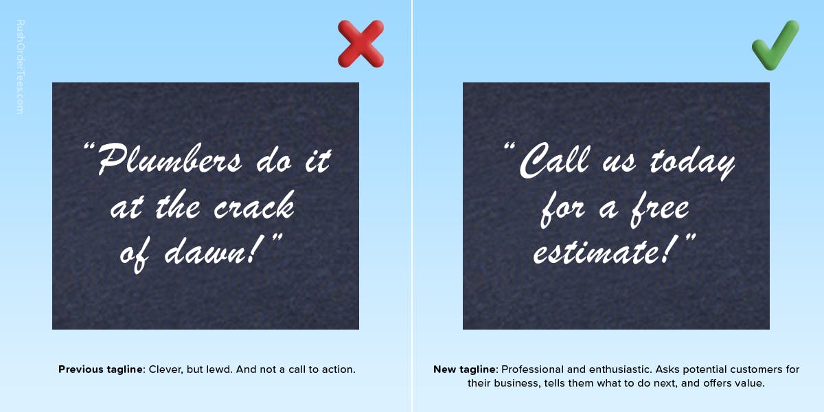
Example order: Choosing an effective messageWhat message is the Leer Plumbing design conveying? The most overt message is the tagline, in quotes: “Plumbers do it at the crack of dawn.” It’s a clever pun and appeals to a certain demographic, but what’s it doing for the business? It could read as crude, or at least lack a certain level of professionalism.So what should it say? Leer Plumbing wants people to call and order their services. How about: Call the best–flush the rest? No. (But that is a little better.) What would really make it effective is adding some value for the customer as well. People always want to know what they’re getting? How about a free estimate? Boom.Now we have a good call-to-action: “Call us today for a free estimate!” Simple, clear, professional.
5. Create an appealing design
Now we get to the overall design. You might think: NOW we get to the design?
So far, each tip has been based on simply setting up the order ideally, or at least correctly. But what if the customer wants to rethink the whole thing? Is a design makeover in order or a totally new branding?
There’s something to be said for legacy designs and logos that have been around since a company’s start. But even the most established brands need to refresh occasionally. Some companies have gone through radical transformations.
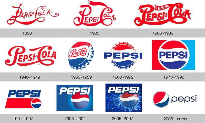
Knowing when to give yourself a refresh is an important decision, especially if you have a well-established brand. I’d submit that right before a major promotional purchase (such as a big T-shirt order) is a great time to do it.
That being said, the more established your brand is especially if your logo is iconic–the more time and effort you should spend on a redesign. Don’t do it just to do it, especially if you have name or image recognition.
I highly recommend trying a variety of typefaces, clip art, layouts, and combinations before making your eventual choice. Keep it black and white first–you can always add the colors, bells, and whistles later.
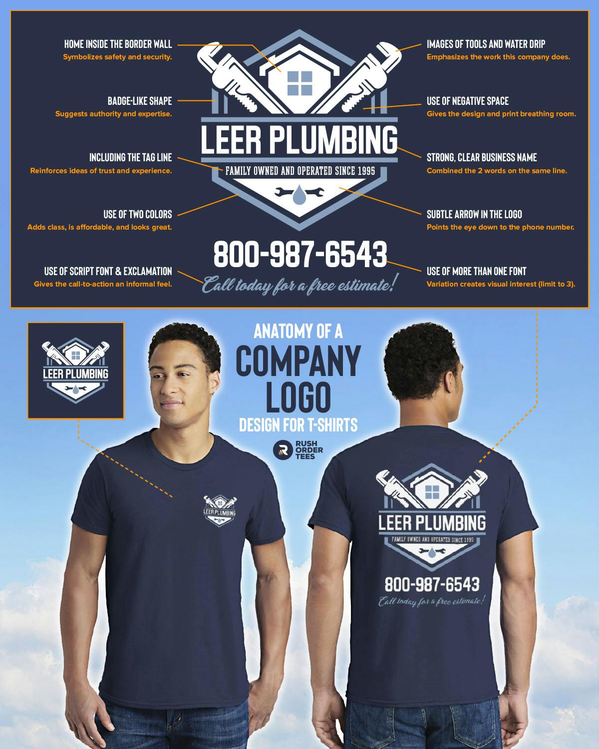
Example order: creating an appealing designSo far, we set up the garment, colors, print locations, and the message. Now it’s time to evaluate the design–which includes the image, the type, and the information as well.Leers’s previous tagline was crude and unprofessional, and we could say the same thing about the cartoon plumber’s image, complete with butt crack. Sure, it’s cute–but is that the best way to present the company Sounds like it’s the perfect time for a brand refresh.Let’s start with a new logo design. Here’s four ideas:Each of the variations has a strong, straightforward and professional look, leaving no doubt what the company does, how established they are, and the level of quality to expect. One big change to point out is taking out the word “services”, then combining “Leer” with “Plumbing” as the business name. It’s another way to avoid any confusion, and it has a better ring to it.Using clean, modern fonts along with stylized plumbing imagery like wrenches, faucets, plungers, a water drip, and a house makes the message clear, even from a distance. And our new plumber character is looking trim and fit compared to the last one. Each of these would work well, and often it comes down to personal taste.

Adding your website to the design
Although putting a business phone number on a T-shirt is mostly a thing of the past, lots of people still do it. (It’s debatable how often people copy down a phone number from a T-shirt.) But a website is a different story.
Nowadays, everyone has a smartphone in their pocket, and they’re much more likely to visit your website before calling your phone number. So hopefully, you have your website in place and a URL that matches your business name.
Should you add it to the design? If your URL is identical to your business name, you don’t need to print it on the shirt. If your URL is considerably different from the business name, and it’s not too long or complicated, that’s when you should think about including it (and no, you don’t need the www).
Example order: Putting it all togetherNow that we have a new logo and graphics for the T-shirt design, it makes sense to pick a color to complement the white ink and navy blue shirt. We’re going with a handsome, calming Columbia Blue ink to represent water.Here’s my new design, along with a mock-up and some additional notation about the choices:A strong, professional redesign like this achieves more than just providing a great company shirt: it effectively communicates value, legitimacy, and trust, and effectiveness. It’s a company shirt that doubles as an ad.Obviously, what works well for one company might not be right for another, and this is just one example. But the principles can extend into many types of company shirts. Including your company shirts.For more on this topic, check out our Top 10 T-shirt Design Tips.
6. Place your order thoughtfully
This last tip is about placing the right order. This can be a big question for many people and easy to screw up–that’s why a wrote a whole post about size breakdowns for group orders. For this post, I’ll give you a quick version of how this topic relates specifically to company shirts. Follow these simple rules, and you’ll avoid mistakes.
Get everyone’s sizes
Sounds simple enough, but easier said than done. I would suggest using a spreadsheet to keep track of everything and a point person to help collect the information.
Some people may not be sure about their size. Have them check the sizing chart, which you can find on each of our product pages. We provide a handy visual sizing guide for each product with real people (who work here!) that look like this:
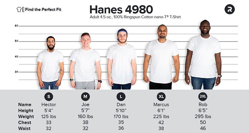
If an employee still is unsure, go the extra step (after the required ridicule) and have them measure a shirt they own that fits, then compare it with the actual measurements for the new shirt, which can be found on the same page.
If you’re ordering anything slim fit, let people know because if they don’t like the more streamlined fit of those types of shirts, they might want to order a size larger than they normally do.
On some, it’s more flattering. On some, it’s too tight. It depends on body type and preference.
Order ladies’ styles for the ladies
There are a couple reasons they make separate styles for the ladies: one is obvious: their bodies are shaped differently than men’s. The other is that some ladies prefer a different cut shirt than men’s or unisex. Typically, they have shorter sleeves, a more contoured fit, shorter torso length, a more open neckline, and a different sizing formula.
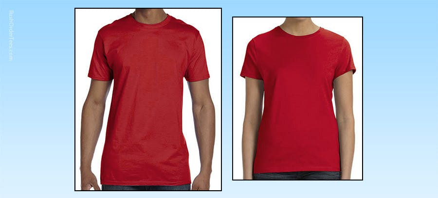
Check to see if the men’s style you’ve chosen has a corresponding ladies’ style; often they do.
What’s nice about using the corresponding style is that everything will be consistent– other than the cut. So the color will be identical, along with the weight, feel, stitching, etc.
Consider matching companion items
Finally, as simple as it is, a T-shirt makes a fine uniform. But if you really want to complete the look, consider adding a hat, apron, hoodie, or another companion item.
With our example order, the staff of Leer Plumbing would look great with a matching navy baseball cap. And for customizing a cap, nothing is better than embroidery.
Printing on a cap is fine, but embroidery is more classy and professional, will last longer, and it’s more affordable than you might think– especially if you order it all together.
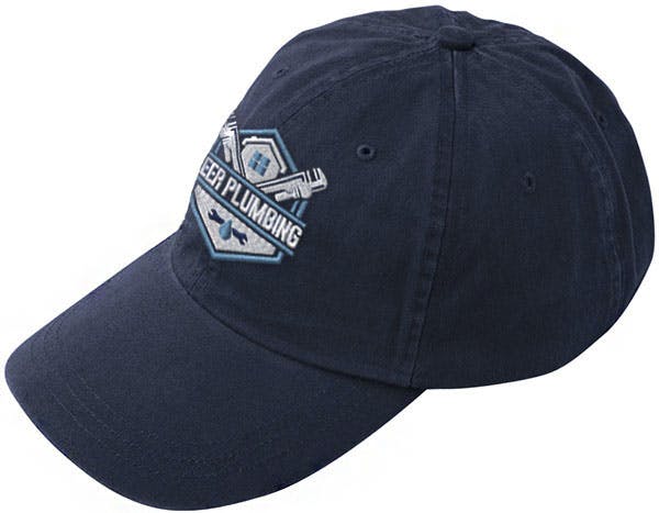
Here’s a closer look at what happens to Leer’s new logo when we digitize it for embroidery. It will typically mean simplifying the design first to remove details that don’t translate into stitched threads, then the digitizing process happens.
Digitizing involves setting up the proper stitch counts, order, styles, tightness, and colors, optimizing the graphic appearance and textures of the design. Luckily, you don’t need to know any of that stuff. Leave it to the pros.
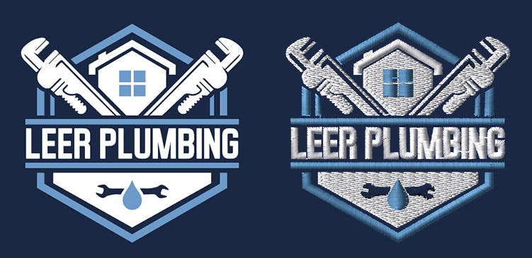
The first thing to notice about the image above is that there is some detail loss (which is why we want to simplify the logo as much as possible). Keep it simple! Tiny type and smaller elements don’t embroider well. Don’t worry, our art team will ensure they set you up for success and will alert you if we need to adjust the design to make it work.
The second thing to be aware of is that the colors might not be identical. Although we have dozens and dozens of thread colors, they don’t always match exactly with their ink counterparts. If you do need a specific color, such as a Pantone match, we can order it for you.
Order more than you think you need
This may seem like a tactic for getting you to order more shirts, but it’s a legit good idea. It’s better to have a few extra than being a few short. The extras are great to have in a pinch when an employee loses, stains, or damages their shirt.
And if your business involves doing dirty jobs like plumbing, it’s best to get a few extra shirts for each employee. Maybe more than a few for some people. You know who they are. Bottom line: put together the biggest order you can to reduce the cost per item–and avoid having to reorder anytime soon.
There you have our top 6 tips for custom company shirts. Ready to order yours? After you get your great new company shirts printed, post a photo and share your story in a review or on social media.

Imri Merritt
About the Author
A graduate of the Multimedia program at the University of the Arts in Philadelphia, Imri Merritt is an industry veteran with over 20 years of graphic design and color separations experience in the screen printing industry.

